We're in the thick of it!
Day 2 of 2010: The Retrospect. Today, we're going to look at what 2010 had to offer us in cinematic still images (how's that for oxymoron?). That's right. That crucial, but short lived, act of advertisement, the poster. 2010 had some winner posters, some awesome (Black Swan), some not so much (The King's Speech). These are the creme de la creme of 2010 posters.
5. Let Me In
Brilliantly evoking the dark and scary atmosphere of Matt Reeves' brilliant film, this poster is quite a sight to behold. Very moody, it's sparse use of color is really striking. The image of Abby lying in a pool of blood is terrifying. Look closer, and see how sad she looks, and it becomes almost heart wrenching, like the movie. Normally, I'd say it overdoes it on the black, but since the image of Abby is that much clearer because of it, I'd say an overabundance of black is a good thing. Plus it just looks sick!
4. Get Him to the Greek
Fine, the movie may not hold up all that well, but this poster is still hilarious! Effectively capturing the insanity of the movie, it's also just a funny thing to look at. Russell Brand is all kinds of crazy and depraved, throwing up those horns as Dio were on the other side of the picture and he wanted to impress him. Jonah Hill's terrified and confused expression is the perfect counterpart to this. All in all a hilarious poster for a pretty funny movie.
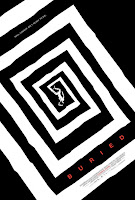
3. Buried
Didn't see the movie. Yeah, I know, you can't believe. How could I reference a movie in my 2010 retrospective without seeing it. Well, I have seen the poster, so, put a sock in it! Evoking a Hitchcockian motif, this is a very haunting and off-beat poster, effectively capturing the claustrophobia and abject terror of the scenario into which Ryan Reynolds' character is thrown. Now, I've heard that the film wasn't all that. Oh well. At least the poster was pretty effin' boss!
2. Predators
Now that's awesome! Who knew something as simple as a solitary Predator standing with its wrist blade extended could so brilliantly set up a balls to the wall action movie. The minimalist use of color sets up the grim world and tone of the film very well, while the viciousness of the monster's blade and his stance alludes to something far more brutal. The fact that we only see have of the creature gives off a sense of ambiguity. We ain't never seen Predators like this before. What else is gonna be new? This is a poster I would be proud to have hanging in my room.
1. Inception
This is a poster I have hanging in my room. This was, quite simply, the best example of one sheet advertisement to come out this year. Not only is it an artistic achievement in its own right, it expertly sets the tone and feel of Nolan's film. This poster is positively sick! I mean, come on! How can you not look at the picture and walk away impressed? Nolan's film is a mind trip. This poster is a mind trip. In a year full of hundreds of one sheets, this is the one that best fit the film it was attached to. That and, Joseph Gordon-Levitt is holding a really big gun. What's not to like?
Well, that was fun. Tune in tomorrow for Top 5 Best Trailers of 2010. Cya tomorrow children. Don't drive without the lights on.


That ain't my favorite Inception poster, but it's a good one. And I'm with you on the rest, but...that Get Him to the Greek one? Really? I won't deny that it captures the essence of the film in a certain way, but it's a barely-slight variation on the types of poster's Apatow and his ilk have been making for years now. Stock photo shoot with plain background...boring.
ReplyDeleteHa...was writing something about Dinner for Schmucks and happened upon its poster once again...look familiar?
ReplyDeleteHmmm... now that you mention it...
ReplyDelete